KITS Brandbook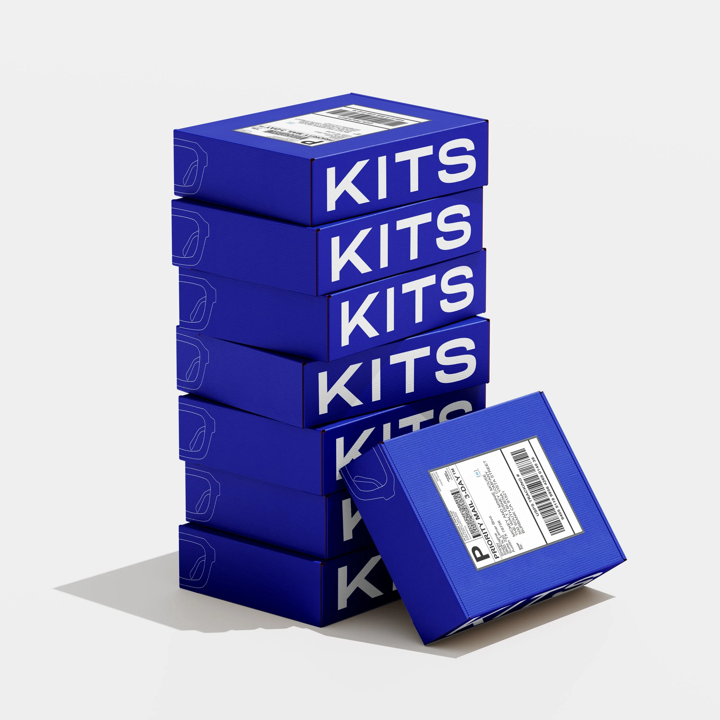

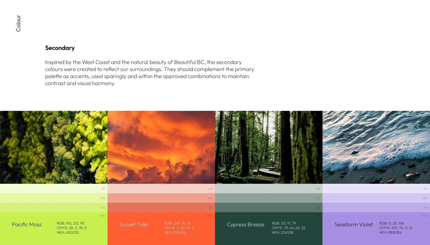
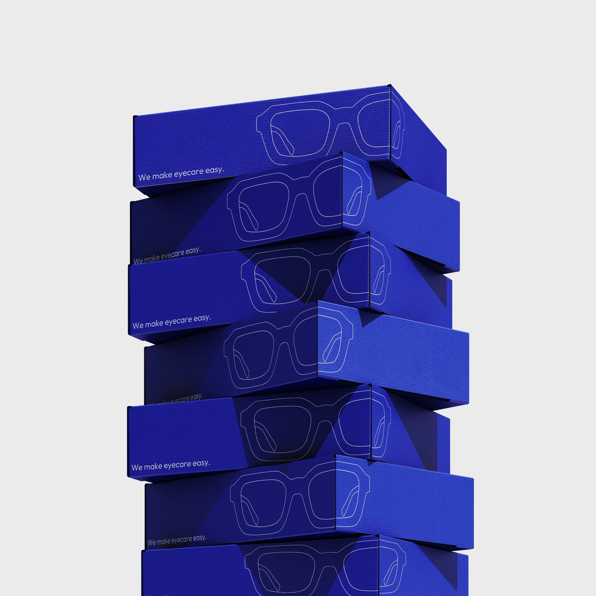
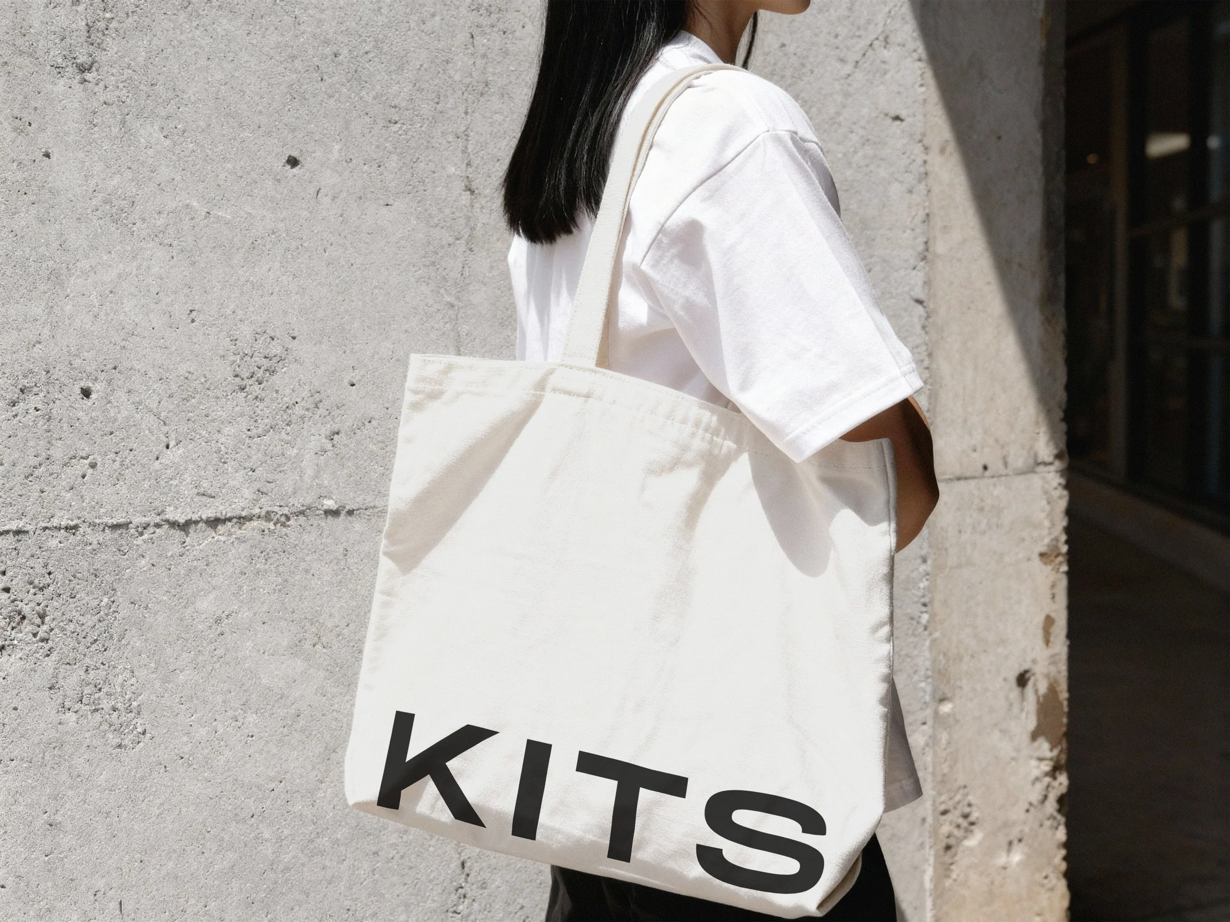
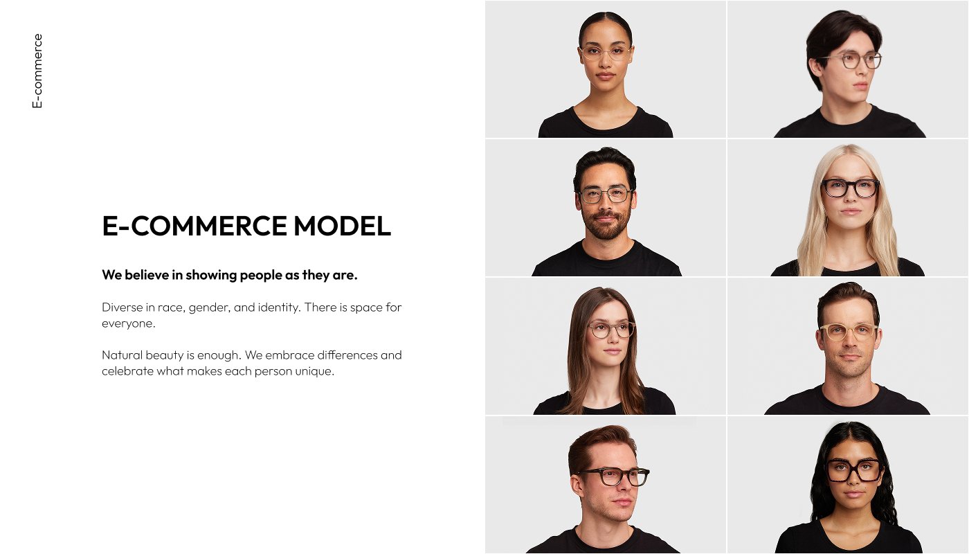
By leading creative direction across the full brandbook, from visual language and photography style to the Blue Box rollout, I established a cohesive ecommerce photography system, defined clear before/after standards, and ensured every element felt like it belonged to the same world. Drawing inspiration from the natural beauty of British Columbia, I expanded the brand's colour system with a secondary palette that added depth, warmth, and character to the visual identity. The result was a scalable visual identity that finally matched the quality of the product itself.
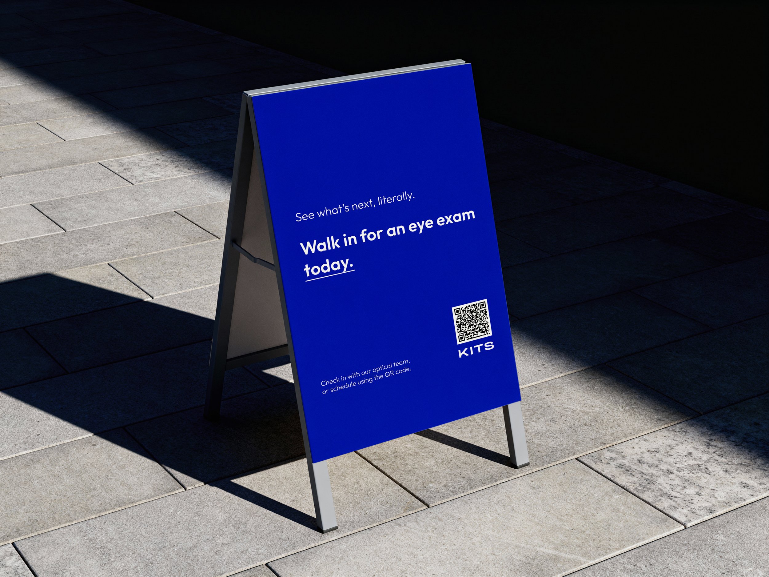
The brand had strong foundations, but the visual identity wasn't keeping pace. Inconsistent ecommerce photography, no clear system, and a presence that consistently undersold the product across every touchpoint.
Brand identity
Ecommerce
Art direction